Now I have my Portfolio finalized I wanted some feedback about it. Unfortunately the design company I was taking it to had to cancel as they had a last minute meeting with a client. Which is fully understandable. Fortunately I was able to see Thoughtful at such short notice. Stuart and Chris sat down and looked at my work with me. As I had designed a booklet instead of a box they were a little concerned but after speaking to them about my reasons we decided that it is a good idea to have as a sort of leave behind as well as a portfolio box.
As far as my work was concerned they seemed very pleased with it, they advised that I had a good body of work and it was laid out well. Stuart added that the book was very simply laid out and felt clean and light weight and was nice to look at. Small things they both picked up on was the leading and positioning of the type I had used to explain each brief. I have taken this into consideration as they made it obvious me to that the small things will be picked up on and noticed more than the work itself.
Overall I was very pleased with the feedback I received from Stuart and Chris as they have given me confidence in my work and also made me think that everything needs to be checked over and over again to ensure that no mistakes are made. I am hoping to get more visits over the summer so I can get more feedback from different people.
Tuesday, 12 May 2009
Friday, 8 May 2009
HD designs
Here is my contact report with HD designs
 I have recently had a reply from him telling me he had had a hectic week so he will email me next week to organize a visit.
 I have recently had a reply from him telling me he had had a hectic week so he will email me next week to organize a visit.
Normal Bias
Whilst on Graphic Hug I came across a company called Normal Bias. They are experimental art and design house. I liked the editorial work that they had done.


 It is obvious in this magazine they designed for Fleeing from Pigeons Publishing that they have stuck to a grid structure, which I find is very useful when designing editorial peices. This peice or work proves that grids can be very effective. The images work well alongside the text and the hierarchy is also set out great.


 It is obvious in this magazine they designed for Fleeing from Pigeons Publishing that they have stuck to a grid structure, which I find is very useful when designing editorial peices. This peice or work proves that grids can be very effective. The images work well alongside the text and the hierarchy is also set out great.
Viral Marketing
What is Viral marketing??
Viral marketing and viral advertising refer to marketing techniques that use social networks and increase awareness, such as word of mouth, internet. Viral promotions take form of video clips, interactive flash games, advergames, ebooks, brandable software, images, or even messages.
In 2006, shortly before Christmas, Threshers leaked a voucher worth 40% off wine and champagne via the internet. Apparently the voucher was only intended for suppliers and the belief that Threshers had mistakenly released the voucher made it spread faster and faster around the world via email, social networks and blogs.

Threshers pretended to be worried about losing money on the promotion but no doubt ended up making a huge profit and getting publicity in a month than they got for the whole year.
It is proven that Viral marketing is very effective. And is very cost effective.
Viral marketing and viral advertising refer to marketing techniques that use social networks and increase awareness, such as word of mouth, internet. Viral promotions take form of video clips, interactive flash games, advergames, ebooks, brandable software, images, or even messages.
In 2006, shortly before Christmas, Threshers leaked a voucher worth 40% off wine and champagne via the internet. Apparently the voucher was only intended for suppliers and the belief that Threshers had mistakenly released the voucher made it spread faster and faster around the world via email, social networks and blogs.

Threshers pretended to be worried about losing money on the promotion but no doubt ended up making a huge profit and getting publicity in a month than they got for the whole year.
Watch as Ronaldinho takes delivery of a new pair of boots and spends over two minutes demonstrating the most amazing football skills the internet has ever seen.
23.5 million people have watched this ad on YouTube. Pure genius.
It is proven that Viral marketing is very effective. And is very cost effective.
Advertising campaigns
Advertisements are something we come face to face with on a day to day basis. Some of these are very minimal such as ads in the news paper and some are as big as billboards. Billboards are a great way of getting a message across, whether your on the bus, walking down the street, driving in your car you at some time look at billboards and advertisements.
JWT London did a chocolate advertisement for Kit Kat.

I think this is a great peice of advertising, not only would it be aimed at the people who see but but it would be passed on in viral way.
Whilst still on the chocolate topic here is a piece of advertiseing for Dairy Milk, I found this on a blog but there was no reference for where it was from.
 This is great as the actual billboard is used for the design.
Unconvential layouts
Unconventional layouts are a common feature of Postmodern art and design. I do link this type of work to the work that I produce. The layouts are different and have a twist to the layout which makes it more pleasing to the eye.
Below is some work by Barney Bubbles also known as Colin Fulcher, his work is obviously Postmodern and the unconventional layout side or postmodernism is definitely apparent in his work. Barney worked on Album covers alot.


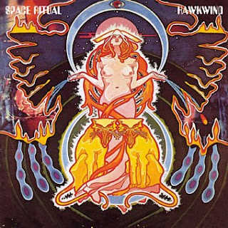
Below is some work by Barney Bubbles also known as Colin Fulcher, his work is obviously Postmodern and the unconventional layout side or postmodernism is definitely apparent in his work. Barney worked on Album covers alot.


Thursday, 7 May 2009
Guerilla Marketing
What is Guerilla Marketing??
Guerrilla marketing is an unconventional selection of promotions that relies on time, energy and imagination rather than a big marketing budget. Guerrilla marketing tactics are unexpected and unconventional; consumers are targeted in unexpected places, which can make the idea that's being marketed memorable.
I found the images below from Amid Pejman's blog
 Slim: same idea, 3 different products: Slim Fast
 Have fun: Sex shop advertising on the streets of a city
 Volkswagen Polo guerilla campaign: small, but tough.

 Crashed car placed in a parking lot to announce a Monster Trucks show
 Jeep Parking: Painted parking spaces to advertise Jeep's ability to be driven on rough terrain.
 Holidays: Everyone is going on a Virgin Holiday. Suitcases placed in the hands of statues
 DHL: If it is where it belongs, it was probably delivered by DHL (click for larger view)

 Axe was always good with advertising... this one is placed next to an exit sign
 All you can eat motorway rest stop at the entrance in a tunnel

Guerrilla marketing is an unconventional selection of promotions that relies on time, energy and imagination rather than a big marketing budget. Guerrilla marketing tactics are unexpected and unconventional; consumers are targeted in unexpected places, which can make the idea that's being marketed memorable.
I found the images below from Amid Pejman's blog
Superman returns ad
 Slim: same idea, 3 different products: Slim Fast
 Have fun: Sex shop advertising on the streets of a city
 Volkswagen Polo guerilla campaign: small, but tough.
 Crashed car placed in a parking lot to announce a Monster Trucks show
 Jeep Parking: Painted parking spaces to advertise Jeep's ability to be driven on rough terrain.
 Holidays: Everyone is going on a Virgin Holiday. Suitcases placed in the hands of statues
 DHL: If it is where it belongs, it was probably delivered by DHL (click for larger view)
"Use only what you need" from Denver Water
 Axe was always good with advertising... this one is placed next to an exit sign
 All you can eat motorway rest stop at the entrance in a tunnel
Otl Aicher
Whilst on Graphic Hug a came across some work by Otl Aicher, the work published on the blog was Aicher design work for the Olympic games in Munchen 1972.


Craig Oldham Vs Truth (1000 word comparison)
During this year, a number of designers have come in to talk about their work. These include Truth, Music, Tal Rosner, Fudge, Fake ID and Glorious. Some of the lectures I have enjoyed a lot and others not so much, this is because each one will have different ways of presenting their work and giving advice. One of the lectures presented was from Truth, a small Graphic Design company, just made up of two people who used to work for McCann Erickson which is a major world wide Advertising company. Darren from Truth was very much into designing typography, over the years he designed quite a wide range of fonts, one which was in fact used in the mast head for the loaded magazine. Some of these fonts are Berliner, Sodium, Mechanic Gothic, Amplifier.
When lecturers come in to speak to us I find most people are more interested when work is shown that we see in our everyday life. This was definitely apparent in their work. They had done work for the likes of: Allsports, Sony, First Advice and Durex.
Truth obviously needed other people to join then in doing their work, as they were such a small company. They thought that this was a good thing as they were always in control and could choose who they liked to do the work. As they were such a small company they had a lot of stuff to do in a small space of time. They would have to speak to the client about their work and the reasons why they had done it, just like all agencies, they explained that its difficult to just hand something to a client and expect them to like it without you explaining it to them.
Craig Oldham has only been graduated 3years, he used to work for the Chase but is currently working for Music. Whilst at the chase he did a publication called 12 in 12 (12 things you might learn in your first year as a designer) This publication did win awards. Craig’s lecture was about his publication, which was very different. Craig has a very strong personality; he likes to make jokes which is why I found his lecture really interesting. This was a different talk from most which I had attended in the past as Craig had only graduated from university three years ago so his understanding on being a student was fairly fresh in his mind. He talked about staying up all night trying to meet deadlines while being a student. He seemed very passionate about his work. Like Truth Craig did show us some of his work, why wouldn’t he? This wasn’t the main part of his lecture though, Truth did what most designers do when they come in to talk to us and told us about what they had done in the design world and then shown us work, although this was good I find that after a few lectures of people coming in saying the same thing and showing the same thing it gets a bit repetitive.
Craig talked through all 12 of the points in his publication. He brought up a point which I found was a great question to ask “Are you a logical designer or an emotional designer? This question really did make me think. Logical designers do things that have an obvious purpose like toilet signs, no parking signs ect.

Then on the other hand there are designers who have an emotional eye for things, who would design something with a purpose but with a twist.

Being asked to think what type of designer you think you are was a really good question. I am still unsure and I’m sure many people will be, it is always fun to make your designs look emotional and have a great idea behind them, but at the same time you want your idea to work and be obvious. This is something young designers like myself need to consider as this splits up the different companies.
Craig asked us to think about what our strengths and weaknesses were?? He told us that he knew his weaknesses, being he wasn't too good at grids and web designing, a piece of advice he gave us was to try and get better by asking questions and seeing what other people are good at. Don't be embarrassed about telling people your strengths and weaknesses.The main points I took out of this part of the lecture was to have a hit list and research them. Be punctual, that a little enthusiasm goes a long way and most of all be yourself.
I found Craigs lecture really useful especially at this time of the year whilst trying to organise portfolio visits and creating my portfolio. Craig seems really down to earth and says things how they are. I think this is a great attitude to have while being in this industry. I did also enjoy the lecture by Truth as they shown that if you try and you believe in yourself aims are reachable, they left their easy job where they had people around to do things for them to be on their own where they had to do every little thing them self. Although I enjoyed both lectures as designers they are both very different and shown them selves is a different way. As Craig has only been out of the industry for three years, he spoke about things that we could relate to, also the majority of his talk was to give us advise, he did show us his work too. They do both work in different environment, Craig works for a very large company with different people to bounce ideas off and work with, where as Truth are a small company but still work with lots of different people.
I feel I took a lot out of both of these lectures as they were both so different it makes you realise that there are so many different things to do with graphic design and different ways of being involved. Craigs attitude was very enthusiastic and really made me think that things can be achieved if you try, which is the same thing I got from the Truth lecture.
When lecturers come in to speak to us I find most people are more interested when work is shown that we see in our everyday life. This was definitely apparent in their work. They had done work for the likes of: Allsports, Sony, First Advice and Durex.
Truth obviously needed other people to join then in doing their work, as they were such a small company. They thought that this was a good thing as they were always in control and could choose who they liked to do the work. As they were such a small company they had a lot of stuff to do in a small space of time. They would have to speak to the client about their work and the reasons why they had done it, just like all agencies, they explained that its difficult to just hand something to a client and expect them to like it without you explaining it to them.

Craig Oldham has only been graduated 3years, he used to work for the Chase but is currently working for Music. Whilst at the chase he did a publication called 12 in 12 (12 things you might learn in your first year as a designer) This publication did win awards. Craig’s lecture was about his publication, which was very different. Craig has a very strong personality; he likes to make jokes which is why I found his lecture really interesting. This was a different talk from most which I had attended in the past as Craig had only graduated from university three years ago so his understanding on being a student was fairly fresh in his mind. He talked about staying up all night trying to meet deadlines while being a student. He seemed very passionate about his work. Like Truth Craig did show us some of his work, why wouldn’t he? This wasn’t the main part of his lecture though, Truth did what most designers do when they come in to talk to us and told us about what they had done in the design world and then shown us work, although this was good I find that after a few lectures of people coming in saying the same thing and showing the same thing it gets a bit repetitive.
Craig talked through all 12 of the points in his publication. He brought up a point which I found was a great question to ask “Are you a logical designer or an emotional designer? This question really did make me think. Logical designers do things that have an obvious purpose like toilet signs, no parking signs ect.

Then on the other hand there are designers who have an emotional eye for things, who would design something with a purpose but with a twist.

Being asked to think what type of designer you think you are was a really good question. I am still unsure and I’m sure many people will be, it is always fun to make your designs look emotional and have a great idea behind them, but at the same time you want your idea to work and be obvious. This is something young designers like myself need to consider as this splits up the different companies.
Craig asked us to think about what our strengths and weaknesses were?? He told us that he knew his weaknesses, being he wasn't too good at grids and web designing, a piece of advice he gave us was to try and get better by asking questions and seeing what other people are good at. Don't be embarrassed about telling people your strengths and weaknesses.The main points I took out of this part of the lecture was to have a hit list and research them. Be punctual, that a little enthusiasm goes a long way and most of all be yourself.
I found Craigs lecture really useful especially at this time of the year whilst trying to organise portfolio visits and creating my portfolio. Craig seems really down to earth and says things how they are. I think this is a great attitude to have while being in this industry. I did also enjoy the lecture by Truth as they shown that if you try and you believe in yourself aims are reachable, they left their easy job where they had people around to do things for them to be on their own where they had to do every little thing them self. Although I enjoyed both lectures as designers they are both very different and shown them selves is a different way. As Craig has only been out of the industry for three years, he spoke about things that we could relate to, also the majority of his talk was to give us advise, he did show us his work too. They do both work in different environment, Craig works for a very large company with different people to bounce ideas off and work with, where as Truth are a small company but still work with lots of different people.
I feel I took a lot out of both of these lectures as they were both so different it makes you realise that there are so many different things to do with graphic design and different ways of being involved. Craigs attitude was very enthusiastic and really made me think that things can be achieved if you try, which is the same thing I got from the Truth lecture.
Ben Deter
Whist looking at Dirty Mouse I came across a design called Ben Deter,
Ben studied Visual Communication at Northern Illinois University and then later moved on to work in Poland at the Academy of Fine Arts in Katowice, he then moved over Chicago and did an internship at a company called Thirst. He then began working full-time under the professional mentorship of Rick Valicenti and John Pobojewski becoming a multidisciplinary designer.
Below is a seasonal greetings card designed for Merchandise Mart properties of a sea T-O-G-E-T-H-E-R is spelt out with custom type and one of the Merchandises Mart's many themes. This was designed at Thirst.


Ivan Chermayeff
Ivan Chermayeff - Below is some work by Ivan Chermayeff, who works for a Graphic design company Chermayeff & Geismar. I came across his work whilst on noisy decent graphics...


Real or Fake
I was searching through the internet and came across a page about images that are taken and whether or not they are real or fake. I found this really interesting as it just goes to show that by using image minipulation it is easy to make something so simple look like something else.
 Fake
Fake
Human remains inside crocodile
 Real
Real
Huge House cat
 Real
Real
Huge house cat
 Fake
Fake
Giant Rabbit
 Real
Real
Dog meets Porcupine
 Real
Real
 Fake
Fake
Dead frog in frozen peas
 Real
Real
Cash seized in drug raid
 Real
Real
 Fake
Fake
Unsual Twins
 Real
Real
Animal Human Hybrid
 Fake
FakeHuman remains inside crocodile
 Real
RealHuge House cat
 Real
RealHuge house cat
 Fake
FakeGiant Rabbit
 Real
RealDog meets Porcupine
 Real
RealDead wife in coffee table
 Fake
FakeDead frog in frozen peas
 Real
RealCash seized in drug raid
 Real
RealMermaid Carcuss
 Fake
FakeUnsual Twins
 Real
Real
Subscribe to:
Posts (Atom)
