On Wednesday 28th April myself and Amy organised a visit to see Ste Owen at Love creative. We were aware that at Love a lot of advertising work is done and as we have previously been told our work is very advertise based we thought this was a good idea.
We were greeted by Ste at the door of Love and then went and sat down around a table n began speaking about what we were up to at the moment and as it is close to deadline we spoke about that and how we were getting on. We then began to speak about the lorry show that is being organised at the moment - he found this very interesting. As Ste is an ex member of Stockport College he knows a lot about how the college works. He assured us that he would come down to the show we have at Stockport to see the work. I thought this was great.
Eventually we began to show Ste through our work. He pointed out that although a lot of the work is advertising a lot of design work has gone into it so he told us not to concentrate on just advertising. He also pointed out that it is best to keep a portfolio clean and with nice space. This includes the writing at the bottom. On my current portfolio I have a description on the bottom explaining each brief and how I went about solving it. A good point Ste made was that this is not needed if you are there to explain as the person looking at it sometimes ends up reading it instead of looking at the work. Obviously for a digital portfolio the explanation should be put in.
Ste liked aspects of our work and said it was a great portfolio. He has passed us on a contact for dinosaur who I am to be in contact with.
Ste then took us on a small tour around the studio - it was a lot bigger than I expected. Love has recently taken on a new member of staff who had been working there on placement.
Tuesday, 27 April 2010
Thursday, 15 April 2010
Snowman/Irn Bru
This advert really made me laugh. I really like when two things come together to make one. The snowman really makes me think of when I was a child and christmas time, so there is nothing better than using this to try and sell Irn Bru as this is also something that I enjoyed as a child. The music has been kept the same but the lyrics altered. This is very clever. It is not easy to do but has been done really well.
Clorets advert
I came across this advertising on Just creative and it caught my eye straight away. I think that is because of its shock factor. Sometimes having a shock factor idea in advertising doeswork work but I find in this instance it does. It does make you cringe, but by making you cringe is better than you not seeing the advert and passing right by. One thing I like about the campaign is that nothing drastic changes throughout the series.


The use of white space is used really well in this, that is something that I find as a designer should not be scared of. White space sometimes compliments an idea. As shown above.


The use of white space is used really well in this, that is something that I find as a designer should not be scared of. White space sometimes compliments an idea. As shown above.
Swiss Design
Whilst researching Swiss design I came across this blog.
HowdyHeidi is powered by Switzerland Tourism and swissmiss, it is a visual archive containing all things swiss. When on this website the first thing that caught my eye was the wooden cow, apparently this cow is a childhood memory of many. It has real leather ears and horns. For a swiss person to look at this cow would bring back so many memories. I love memories, especially happy ones. Now I know the story behind this toy I find it to be such a great product.

Looking at different countries outlook on things can bring new ideas to design. I think it is very important to keep all research varied as it can open a world of new routes.
Wednesday, 14 April 2010
Landmine Ketchup
I came across this piece of design by Publicis Mojo on the Die Line.
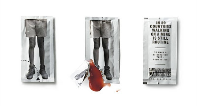
"Using a ketchup sachet, we demonstrated the horrific nature of living in a land mine affected country and how much a part of everyday life that horror is. The idea is simple: as you tear open the sachet you also rip through the child's leg and the ketchup inside pours out like blood."
This idea is so simple and has now become famous all over the world. The reason this caught my eye is not only the great idea but how it is using an everyday product to advertise or make aware something so severe. They have gone away from using poster after poster and have thought about something differemt to do that will have a shock factor and this does that perfectly. The first solution considered is usually a poster and I am becoming more familiar with people pushing their idea one step further and this proves how effective that can be.
Colour Box
Colour Box is an independent design agency based in Liverpool. It was founded in 1993. They do corporate identity, packaging, design for print, illustration and web design. So they work over a variety of different medias.
Illustration is not something that a design and advertising company usually get involved in. It is different with colour box. This is something that they actually enjoy doing. On their website I found something they had said which I found very interesting and true.
"At Colour box we see it differently. Like everything, Illustration has it's place and should only be used when necessary. Used correctly however it can add interest or humor to an otherwise boring document." I really like this as it is really true, I know at college myself and other students use illustration sometimes but we are scared to do so, and more often than not it is not used for our final piece.
Illustration is not 'normally' singled out to be showcased on the majority of Advertising & Design companies websites but it's one of the aspects of Graphic Design that we particularly enjoy being involved
i

Liquid Solution - Liverpool
Liquid is a creative communications agency based in Liverpool, working with big name national clients. As they are one of the leading creative agencies in Liverpool and the Northwest they work on a variety of medias, including advertising, branding, creative design, digital and multimedia, strategic marketing and web design.
This agency caught my eye as they have a variety of different clients. For example they have done some great advertising and website design for Radley, I see these as a really big company, they are aimed at high class weathy people. They have created an integrated advertising campaign to launch Onitsuka Tiger's new store in Liverpool; built a website for Liverpool John Moores University; designed internal communications logos for Warburtons; working on a rebranding project for Medicash and produced powerful and effective direct mail for Fujifilm. These to me stand out as great pieces.
Liquid was asked to launch the new series of the highly successful Fujifilm Frontier Minilabs and develop an integrated campaign which targeted independent retailers and pharmacies who offer self-service photo labs.


Liquid were chosen by Radley to help launch the brand in America. The expansion into the US market, initially through department stores, marked the continued growth of the Radley brand internationally. I really like this work, they have played with the idea of English.


Subscribe to:
Posts (Atom)
