As I am doing my
FMP on packaging design I have been looking at a wide range of designs.
Elmwood have designed more than 20,000 packs in the last 15years for some of the most
successful retail brands including
Asda, Durex and Black Magic.
Their relationship with
Asda has been going on for 15years, they have worked with them over all aspects of design and designed over 15,000 product designs for them.
An old
piece of design work they worked on in 1997 was this. This new design boosted sales by 29.5%...WOW!!!

The packages below are newer designs
Elmood have done. The image used is very nice, it shows how fruity the product us without forcing it on you with type. It is a nice eye catching touch, especially along side bold colours.

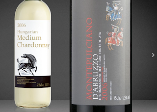
First thing I thought when I saw the images below was not
Asda, the designs one these are great. The simple typeface working along side simple yet
precise imagery. The black and white bold colours of the bottles work against each other and work along with the label on each.
Using the soup (product) as the letter O in Soup. I am unsure on the effectiveness of this. At first thought I did like the product but maybe it is a bit to obvious and many colours are used, which isn't something I like in packaging. With
asda being the client though it does work with products they already have in stall and their overall style.
 Elmwood
 helped Durex move from the world's number one condom brand into the bigger more holistically focused area of sexual
well being.
The condom packs were the first to experience the change. The aim was to make the product stand out more on the shelves. Below is how the product used to look.

By simply moving the logo into the center of the pack it enabled
Elmwood to increase the size of the logo. Also a slight change in colour made the packages more vibrant. New product below.

The small changes have made a big impact.
As
Elmwood were aiming the re-brand on Sexual well-being they realised this was more than just safe sex. They developed Durex existing products into Durex Play.

The colours used are very eye catching and the overall designs are fun yet simple.
Success is what makes packaging worth while....2007-2008 sales was up by 9%, shares increased by 35%.


